Data Visualization Analysis
HackPSU Data Analysis
Responsibilities: AngularJS, Web UI Design, Data Visualization, Marketing Solution
Research & Design Process
General Opportunity
Goal:
In January 2018, I joined the Technology Team for HackPSU, one of the largest of all student-organized hackathons. The team works on new services to provide better experiences for attendees, such as using Amazon Web Services web-hosting for a new administrative portal, switching to a continuous integration system for industry-like code review, and devising an RFID tracking system to replace the QR tracker used in the past. I specialized in creating visualizations of the data that was collected before, during, and after the event, for internal and external analytic use.
I encountered three opportunities for making statistics more meaningful through visualization. These had to do with registration patterns, logistical statistics, and profiles of the attendees who submitted final projects.
All work was oriented towards HackPSU’s mission: “Learn, Build, Share.”
Opportunity 1:
Goal:
The project aimed to find participants’ event registration patterns.
Context:
The Executive Board of HackPSU wanted to understand participant registration data so that it could better market the event. The Board was interested in knowing registration trends and patterns as well as when registration hit its peak.
First, I identified that there are several sources from which most of the attendees had heard of the event, including Facebook and referrals from friends.
Target Audience:
Sponsors and the Executive Board of HackPSU
Design Rational
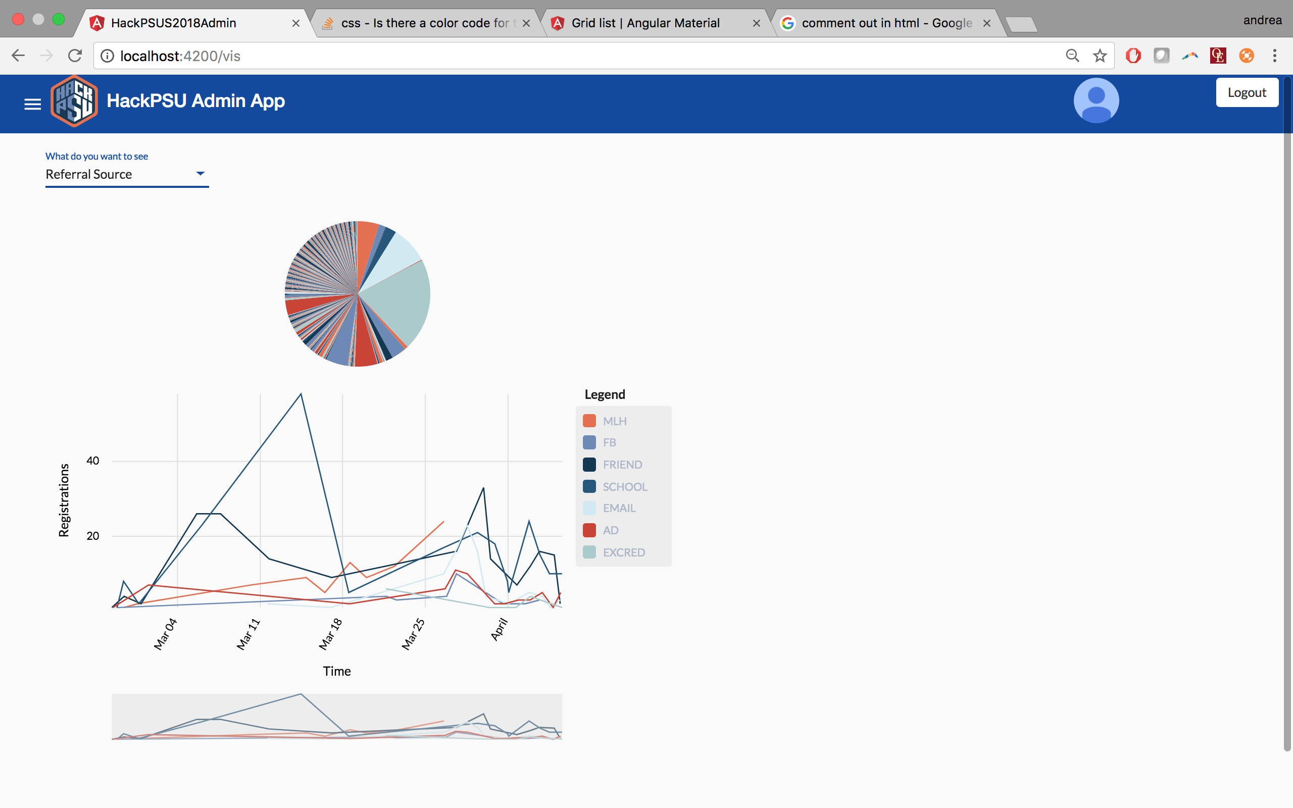
I designed an interactive tool with which the user can choose from various timelines.
The tool was written using AngularJS and JavaScript visualization toolkit and presents a line chart and a pie chart.
The Line chart indicates that registration peaked between March 11 and March 18; this corresponds to a marketing push by the event-marketing team (including distributing flyers and displaying posters at locations with student concentrations).
The Pie Chart illustrates the influence that extra credit from a class had on students’ willingness to register.
Opportunity 2:
Goal:
The project aimed to determine logistically relevant statistics of attendees.
Context:
The Executive Board of HackPSU wanted to understand user profiles so that they could better anticipate several logistical aspects of the event.
I worked on creating representations of the data for students’ shirt sizes (HackPSU had special event shirts made for participants) as well as their dietary restrictions so that the logistics team could have a reference for which shirt sizes and how much diet-specific food to order. During and after previous events, attendees have complained about the food, due to their religious and cultural preferences. In the past, the logistics team had not been aware of the proportion of attendees who have such needs. They hope to avoid such situations in the future.
Target Audience:
The logistics team of HackPSU
Design Rational
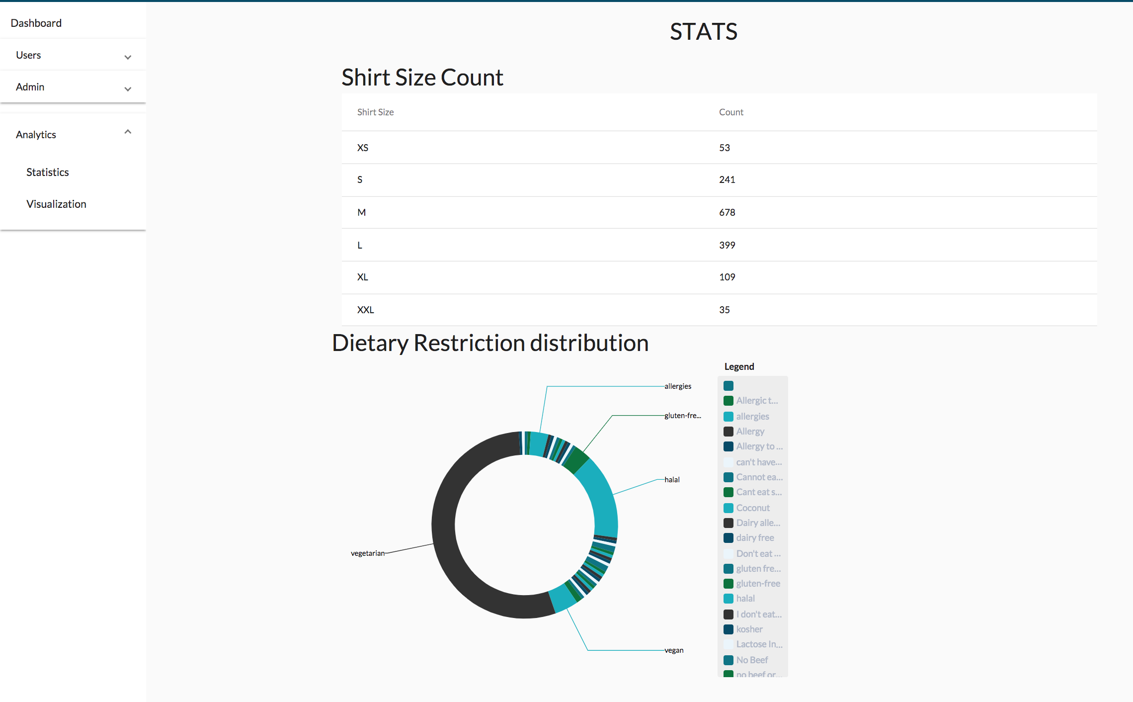
I designed a statistics table and a donut chart, where the user could see the presentation of the number visually.
The tool is written using AngularJS and JavaScript visualization toolkit, presenting a table and a donut chart.
TheTable shows the shirt size of the attendees, and it follows a normal distribution.
The Donut Chart shows the proportion of students with special dietary constraint.
Opportunity 3:
Goal:
The project aimed to attract more students to attend the event and, more importantly, to submit a final project.
Context:
Although there were over 800 attendees for the most recent hackathon, only about 10% of them submitted a final project.
Target Audience:
Major League Hacking and the Executive Board of HackPSU
Design Rational
I designed Shiny App that includes various charts, visualizing the profile features of the attendees.
The tool was written using only R, the statistical programming language, and its user interface tool, Shiny App.
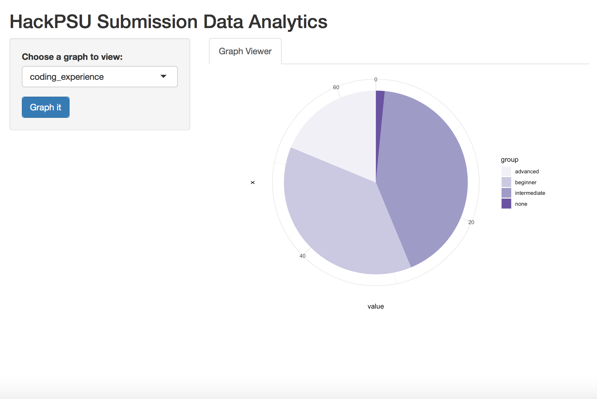
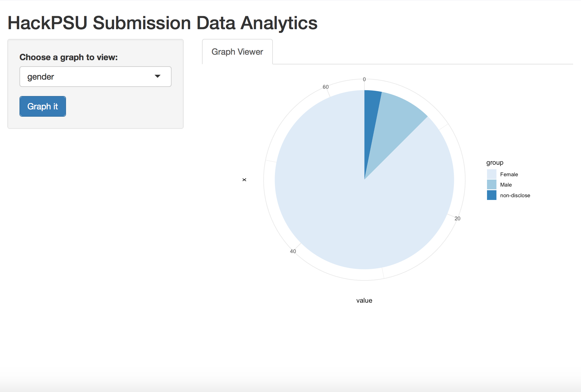
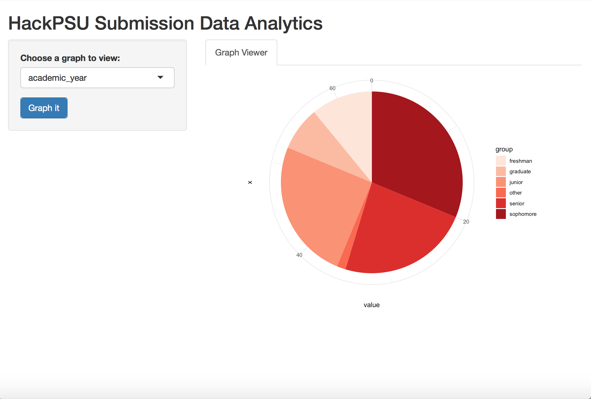
The Pie Chart shows the students’ academic years, gender, and level of coding experience, using slightly varying colors.
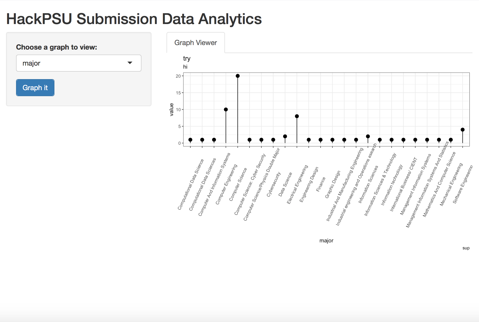
The Lollipop Chart conveys information like a bar chart but with a modernist spin. I decided to use it to represent the students’ academic majors due to the length of some of the majors’ titles.

The Dot Plot is similar to the lollipop chart, but I thought it would be fun to try it out with attendees’ racial affiliation data. It illustrates which racial affiliation was best represented at the event and ranks the rest. A bar chart would have the same effect, but I wanted to try an unconventional graphic device.